Overview:
Paris Notebook – Visual Branding & Illustration
Creating playful, bold, and memorable stationery branding that resonated with both kids and adults.
Problem
Paris Notebook, a stationery brand targeting school kids and young teenagers, needed a distinctive visual identity that felt fun, modern, and appealing. The challenge was to design branding and products that stood out in a crowded stationery market, balancing playfulness with high-quality presentation.
Role & Responsibilities
Lead Designer: responsible for creating the visual branding, illustrations, character design, custom typography, font development, and final product design.
Responsibilities included:
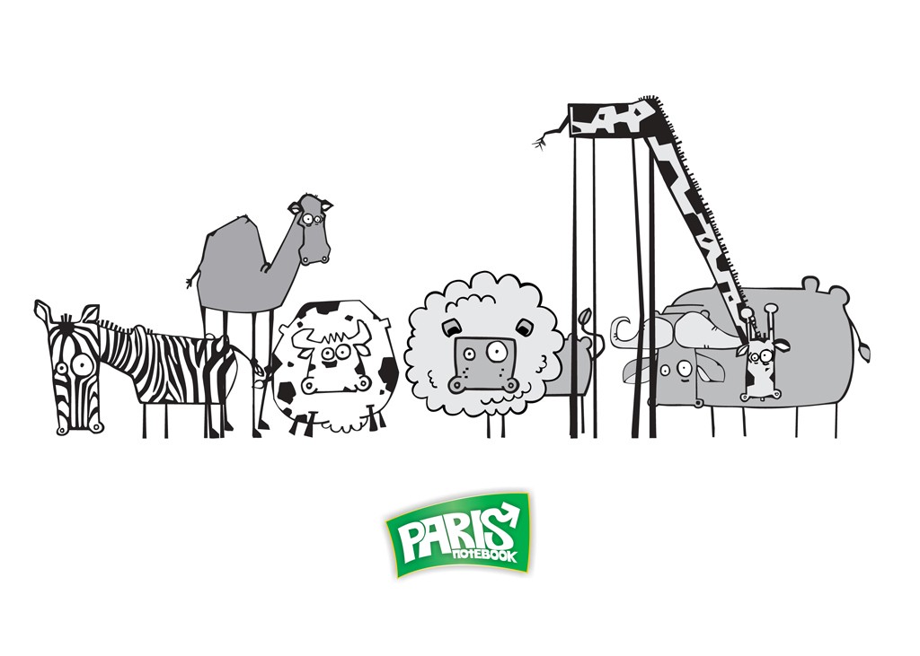
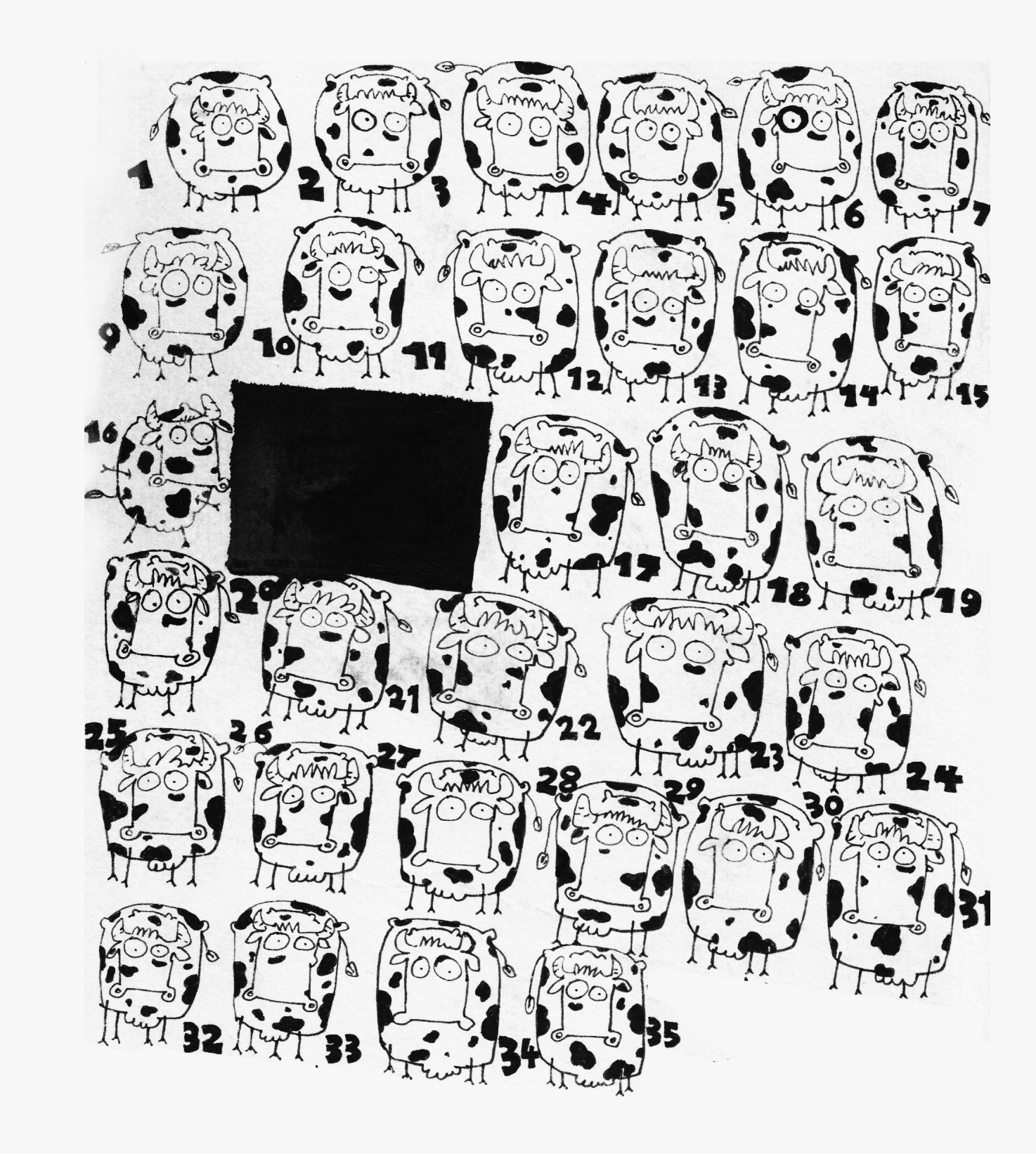
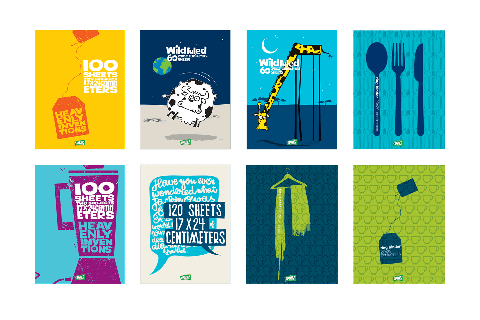
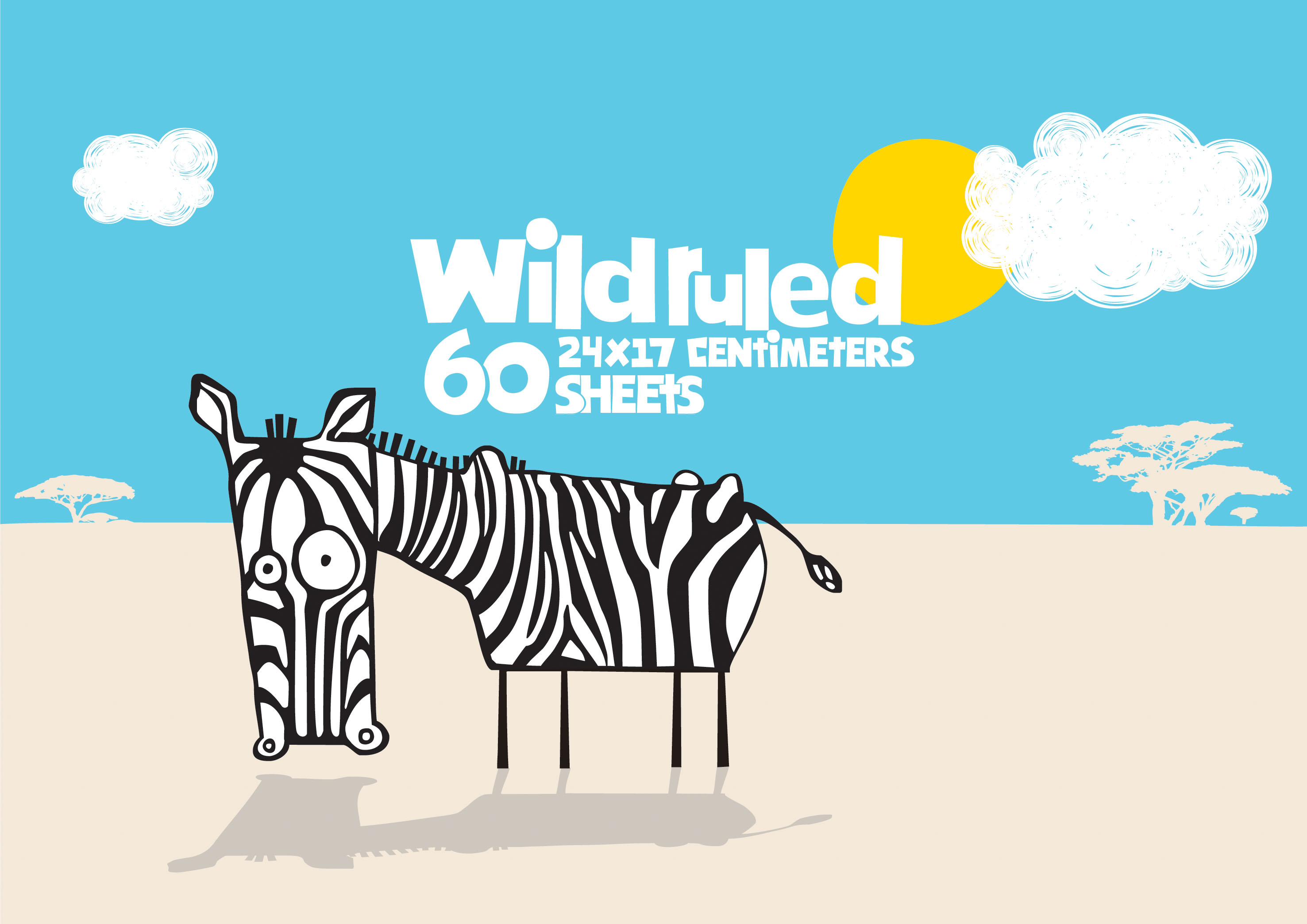
Designing playful animal character illustrations (e.g., zebra, giraffe, etc.)
Developing custom typography and font design
Creating a cohesive visual branding system
Designing notebooks, binders, and product packaging
Ensuring print-ready files with consistent quality
Process
Research & Inspiration:
Studied trends in children’s and teen stationery products
Explored illustration styles that balanced boldness with approachability
Analyzed color palettes and character-driven branding in related markets
Illustration & Branding:
Created expressive animal characters to establish brand personality
Designed a custom font and typography system for product covers
Explored multiple color palettes before finalizing a bold, playful scheme
Product Development:
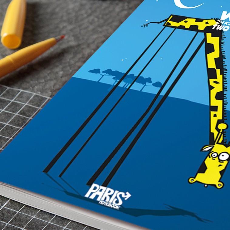
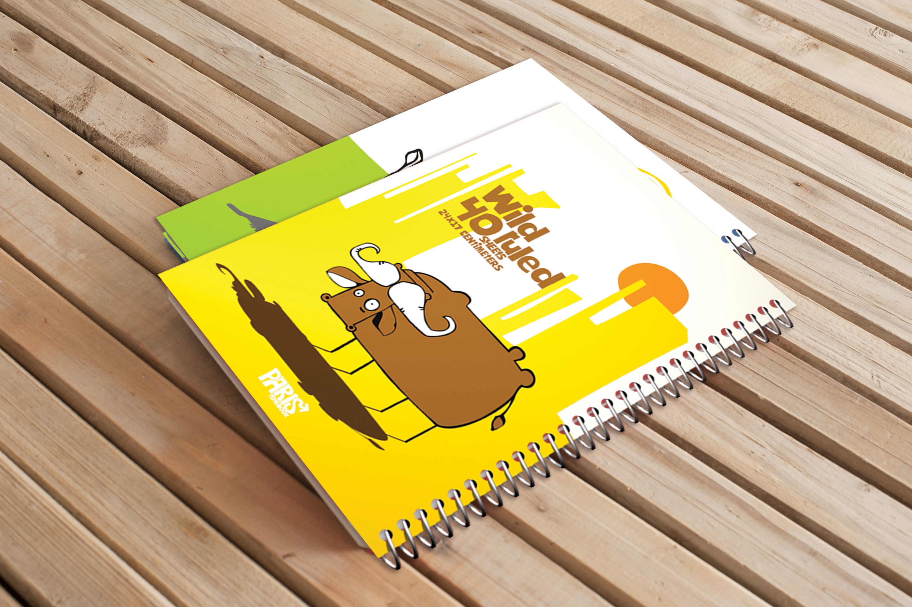
Applied illustrations and branding across notebooks, binders, and packaging
Designed layouts to showcase characters prominently while keeping products functional
Delivered production-ready artwork for final product runs
Challenges & Solutions
Appealing to multiple age groups: Initially designed for kids and teens, but broadened the style to ensure it also appealed to adults.
Balancing fun with quality: Used bold illustration while maintaining clean layouts and high-quality typography to avoid looking childish.
Print consistency: Worked closely on production details to ensure illustrations and colors translated well from digital to print.
Outcomes
A cohesive and memorable brand identity for Paris Notebook
Products successfully targeted kids and teenagers, while unexpectedly resonating with adults
Delivered a full line of notebooks and binders with strong shelf presence
Established a flexible branding system that could scale to future product lines
Lessons Learned
Playful illustration can cross generational boundaries when balanced with quality design
Custom typography reinforces brand identity across products
Attention to production details ensures designs translate effectively from concept to final product