Overview:
Indeed Design System & Semantic Components
Optimizing component libraries to create consistent, accessible, and scalable design experiences.
Problem
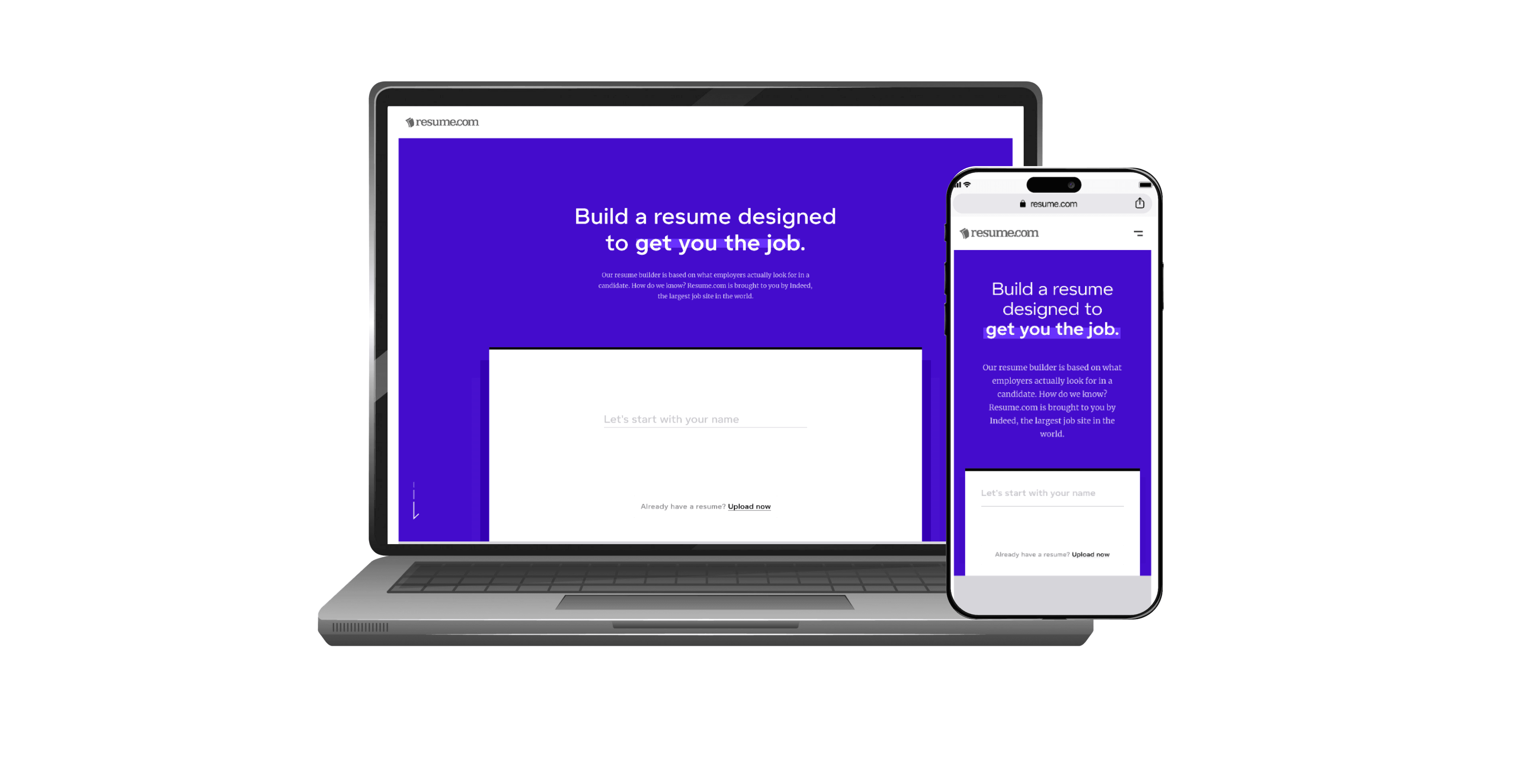
Indeed’s platform is used globally, but the design library was inconsistent and hard to use. Designers created redundant components, developers often implemented designs incorrectly, and documentation lacked clarity. Teams needed a scalable, accessible, and clear system to improve efficiency and maintain consistency.
Role & Responsibilities
Led the creation and optimization of the design system, working closely with developers, content strategists, and localization teams. Responsibilities included:
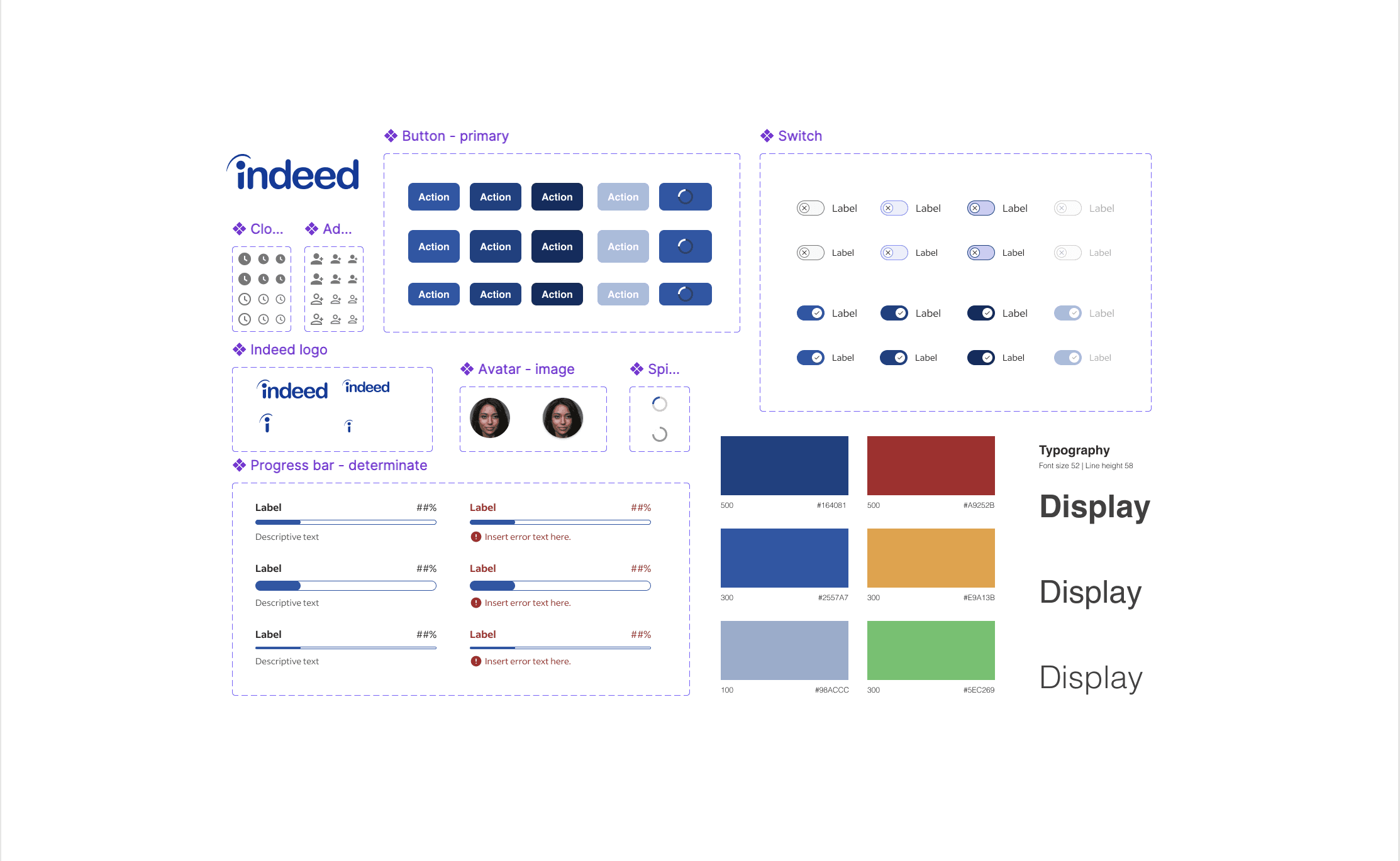
Auditing existing components and usage patterns
Designing and implementing 20+ new components
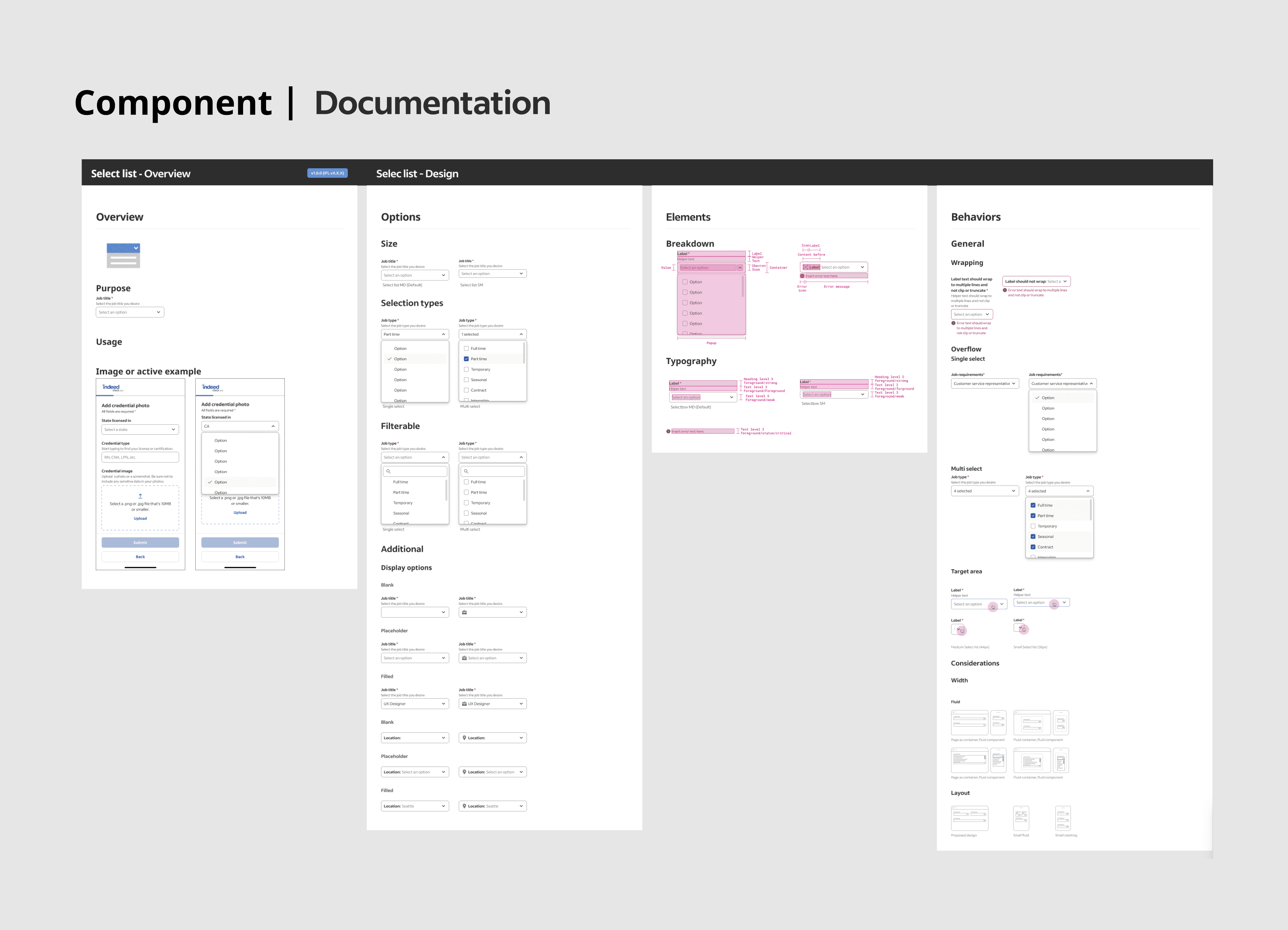
Creating documentation and guidelines for designers and developers
Ensuring accessibility, responsiveness, and localization compliance
Process
Research & Analysis:
Audit of existing components
Competitive analysis of other design systems
Usability testing with internal teams
Component Creation:
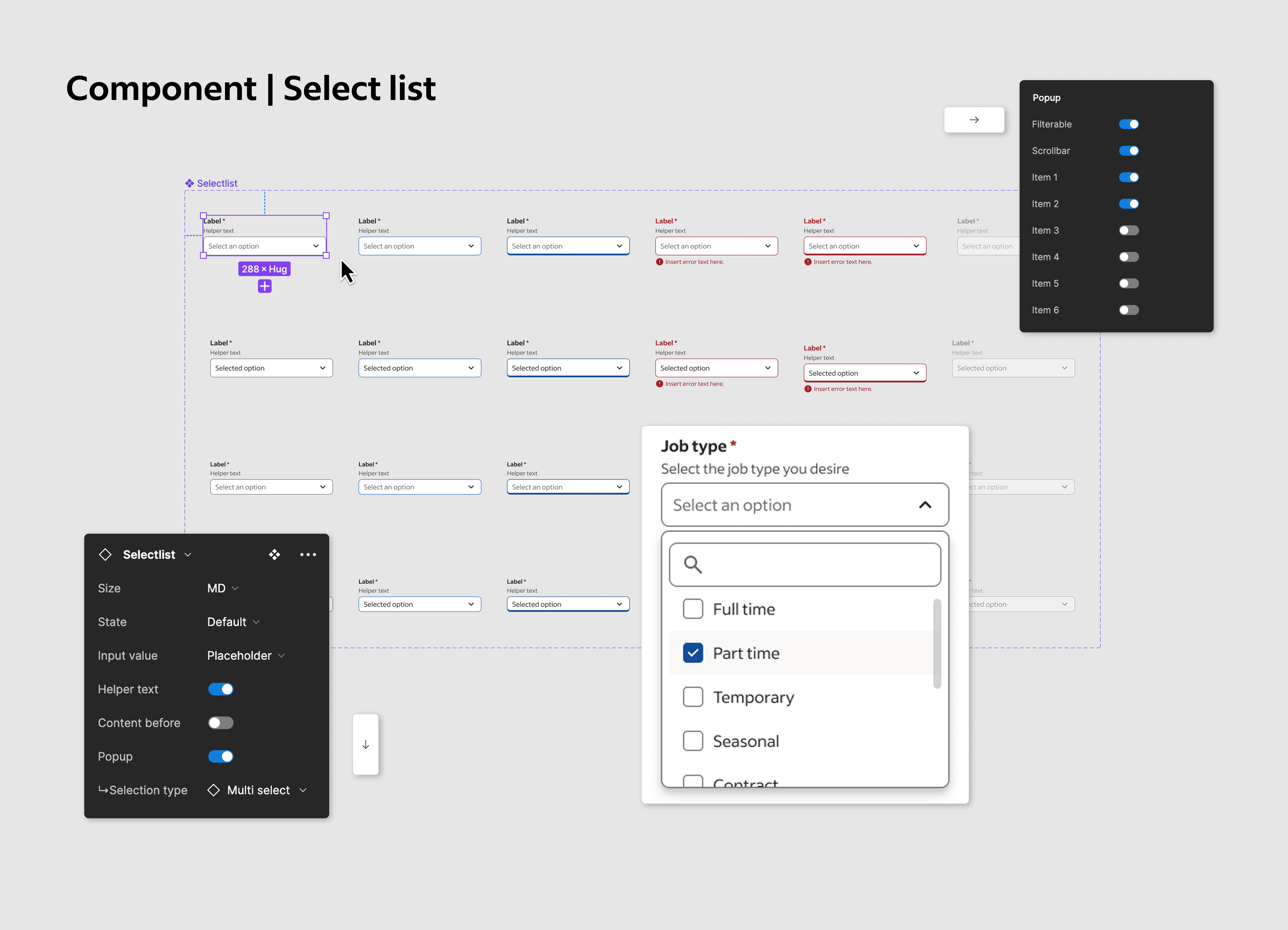
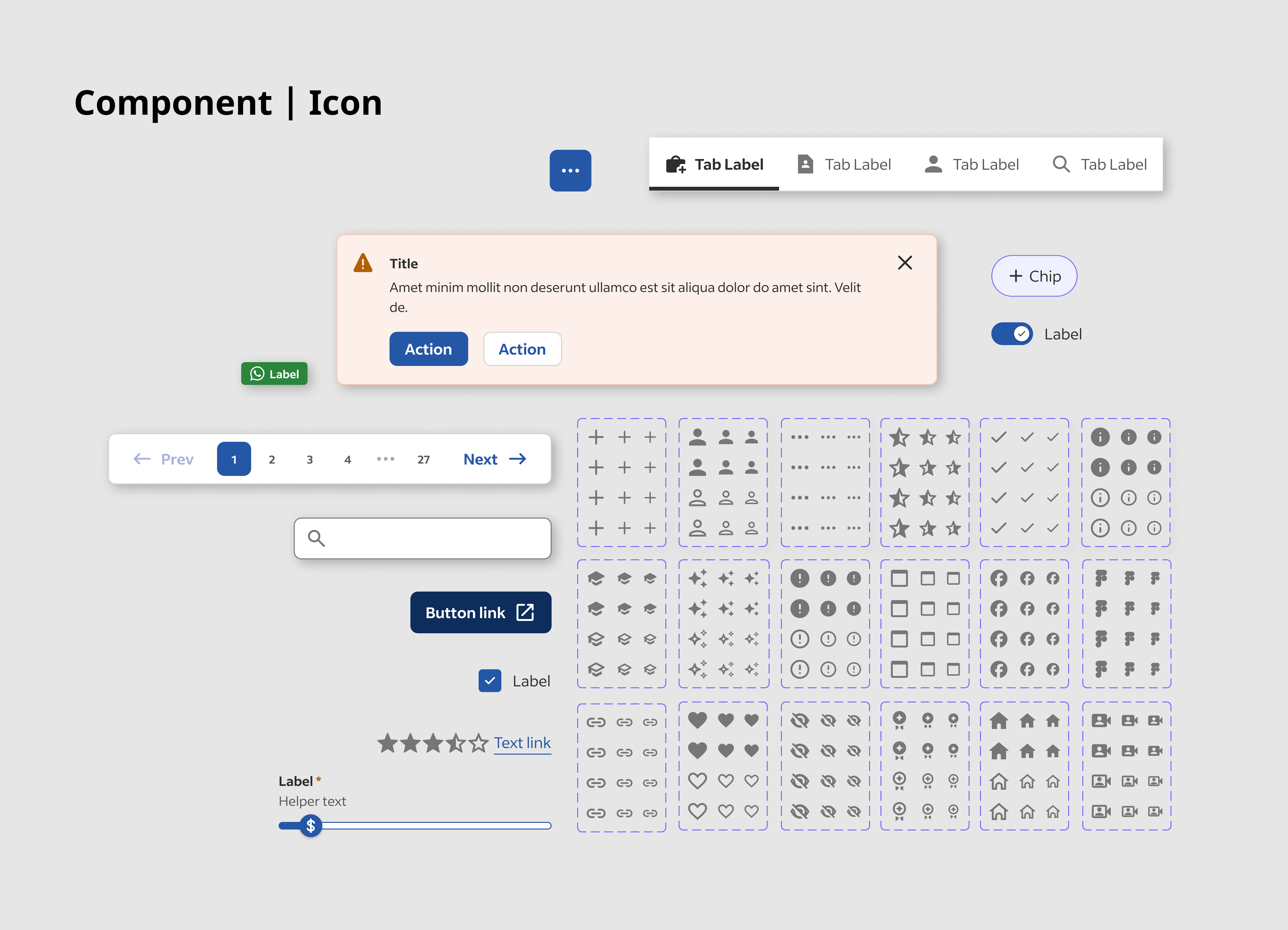
Designed 20+ components with variants (sizes, states, RTL versions)
Created semantic naming conventions
Ensured accessibility and responsiveness
Documentation:
Written guidelines covering usage, behavior, and localization
DocHub or Google Doc-style guides with visuals
Collaboration & Handoff:
Worked closely with developers for implementation
Used Figma tokens for spacing, radius, and colors
Challenges & Solutions
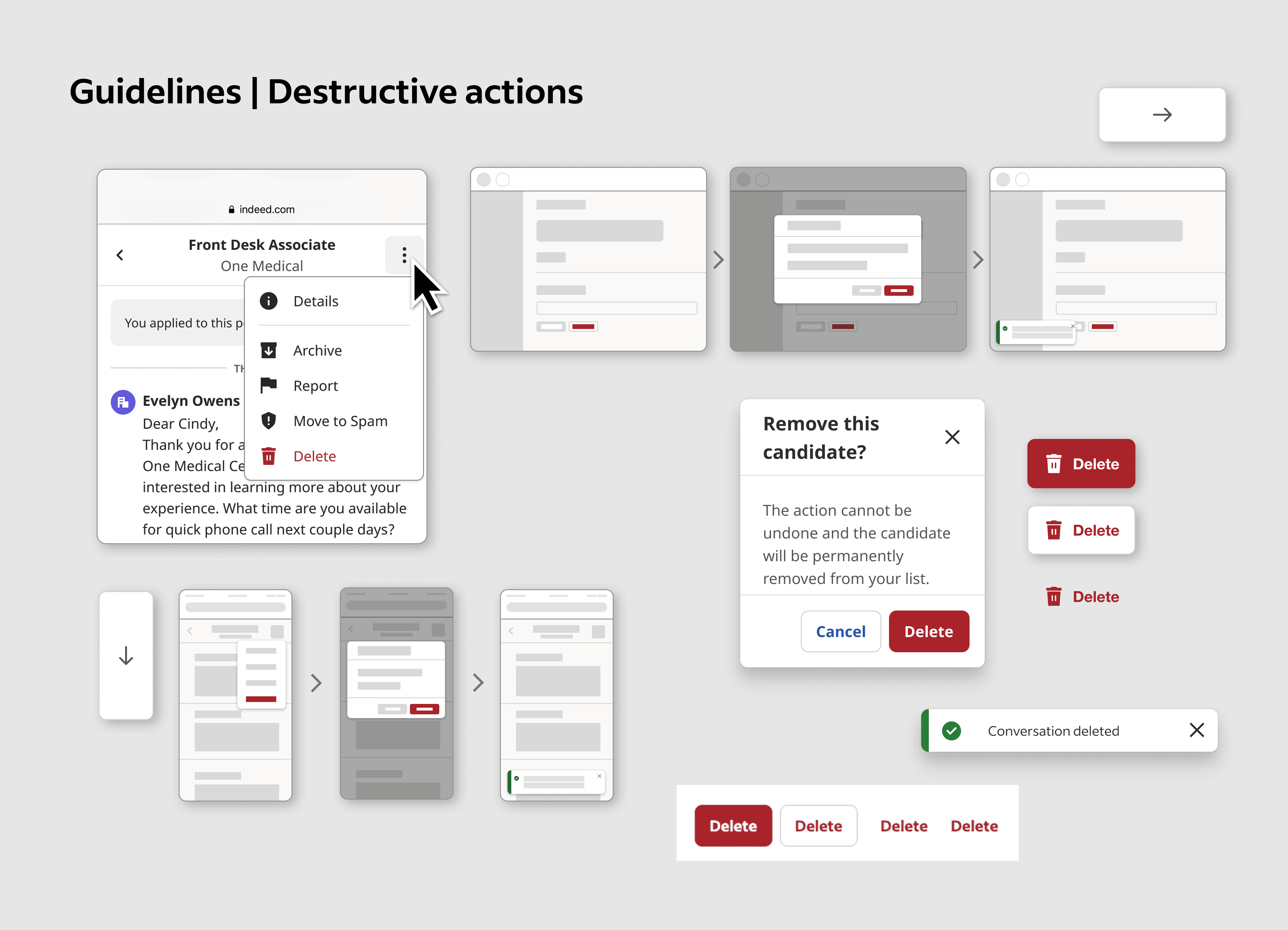
Inconsistent components → Created semantic naming & variants
Misused components → Developed clear documentation & usage examples
Accessibility & localization gaps → Added RTL versions and accessibility checks
Outcomes
20+ new components improved scalability and consistency
Component adoption increased by 60%
Design workflow efficiency improved by 50%
Designer satisfaction rose by 25%
Reduced dev errors and onboarding time for new designers
Lessons Learned
Semantic naming & scalable components are critical for adoption
Clear documentation and cross-team collaboration drive success
Balancing design fidelity with developer feasibility improves implementation
Experience managing a global, multi-team design system